The Beginning
This site started as a personal challenge to see how far I could push my UI design skills. Initially, it was just a blank canvas with a simple “Hello, world” text, a profile picture, and some cringe-worthy content. Over time, I transformed this bare-bones setup into something much more polished and interactive. I’m genuinely surprised at how far I’ve come. Despite the site appearing static, almost all components are interactive, featuring secrets and Easter eggs. Here, I’ll walk you through the various components from top to bottom.
Technologies Used
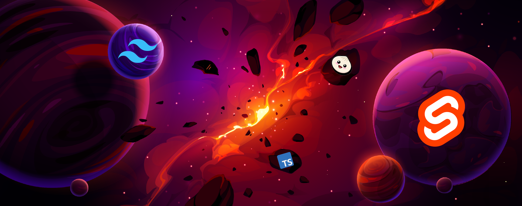
I built this site using Svelte, Tailwind CSS, and the Shad-cn UI library. I highly recommend using a UI library for consistency and efficiency. For example, you can add a without worrying about styling. I used the Montserrat font throughout the site. Avoid using more than two fonts, as it can slow down your site and increase rendering time. Although I used a custom font for aesthetics, it does add a noticeable load time. And smooth animations are made using Motion One.
Dark Mode and Light Mode
I’m a big fan of dark mode and have written about its benefits in another blog post. This site features a theme switcher, making it easy to switch between dark and light modes. Implementing a theme switcher is straightforward, and I recommend all developers include one.
This was made possible by Mode Watcher, a simple theme handling library for Svelte.
Profile
The profile component is simple yet fun. Hover over the profile picture below to see it switch between two images. Here’s how I set it up:
<Profile Image1="static/profile/discord.png" Image2="static/profile/discord.gif" /> Hover me
The implementation uses Svelte’s reactivity:
<script>
    export let Image1: string;
    export let Image2: string;
    export let customStyle: string = '';

    let isHovered = false;

    function handleMouseEnter() {
        isHovered = true;
    }

    function handleMouseLeave() {
        isHovered = false;
    }
</script>

<img
    src={isHovered ? Image2 : Image1}
    on:mouseenter={handleMouseEnter}
    on:mouseleave={handleMouseLeave}
    class={`z-10 h-24 w-24 rounded-full ${customStyle}`}
    alt="Profile"
/>
Discord Card
The Discord card displays my Discord profile details, including display name, username, avatar, banner, bio, badges, avatar decoration, and status. I’m very active on Discord, so I made this card special. I took it a bit further by making a Discord Bot that tracks my status and porvides the needed data to change the border color to showcase my status.
(<-click)In case you are wondering I’m curruntly offline.
GitHub Card
Originally, there was only the Discord card, which felt pretty empty, so I added a GitHub card. The problem I had was what to show in a GitHub card—just a button with a link? Then I checked my GitHub and thought, “What if I can show the stats I have here?” So, I used the GitHub API to pull data from my profile and show the number of contributions and commits. I made it so it gets my profile picture and displays it too, but it adds a slight delay and was unnecessary. GitHub is the first card that was dynamic, cutting down on changing the values manually. The numbers were later animated.
Git Repository Card
This is my most favorite card because of the amount of work that went into it. You might be surprised to know every detail you see is taken by an API. This only works for GitHub repositories. I made the component to be usable by anyone. Provide the username and the repo name, and it will render the card dynamically like magic. The biggest challenge I overcame in the component was, funnily enough, coloring the circle next to the language. I searched the web and found the GitHub colors JSON by ohz. Using it, I made a method to get the color and apply it as the circle color. Don’t add many of these card because it will send a request to Github API for every card you have, And you might be rate-limited. Test the component yourself by entering the GitHub repo URL in the given text input.
<Project username="MeCandyCat" repositoryName="Portfolio" />0
Updated: Loading...
To implement this card, I created a github-utils function that requests data from GitHub. You can access it here, and the Project Card implementation can be found here.
Tool Component
The Tool component is straightforward. It displays tools I’ve used with the provided data. Here’s an example:
<Tool
	name="Adobe Photoshop"
	icon="/icons/PhotoShop.svg"
	badgeText="App"
	description="A professional image editing software."
	customStyle="w-[500px]"
/>
Random Stats Section
The Random Stats section displays stats using APIs from various services. Each card represents my activity on the respective site, like Monkeytype, with a similar theme to the site. Ensure you secure any API tokens used.
Blog Page
There is few ways on creating a static blog page.
- Static HTML/CSS/JS
- Content Management Systems (CMS)
- Custom Backend
- Using Markdown
These options have pros and cons but the best method is using Markdown structure. For the blog page, I chose Markdown with Mdsvex, a powerful tool that combines .md and Svelte, allowing for dynamic content and allows me to work with .md and svelte together! I can use script tags and dynamic stuff with in the markdown file. It takes quite time to setup but the end result is worth it.
And I made a API to give the blog page details. The details are added in the top of the blog as a comment and being extracted by the API and given to display it on /blog page.
SEO Friendly
Additionally I have made this site to be able to be searchable. This process is called Site mapping. By providing the search engines the map of the page (example here).
Site mapping is essential for SEO as it creates a structured outline of the website’s content and hierarchy. This helps search engines crawl and index the site efficiently, leading to improved visibility and organic search rankings.
Discord Event Card
I stumbled upon Discord’s event tab one day and wondered if I could display these Discord stats on a website. Initially, it seemed complicated, requiring authentication to get event details. However, while inspecting the API, I discovered a workaround using Discord’s more efficient internal API. Implementing the card took hours of fine-tuning, but the result was worth it. Although it didn’t initially have a clear purpose in my portfolio, I realized it was a perfect addition to this blog about Discord and the blueprint of this site. You can interact with the component below to see different Discord events.
Loading...
Conclusion
Building this site has been an incredible journey of learning and growth. From starting with a blank canvas to creating a dynamic and interactive portfolio, every step has been a new challenge and an opportunity to improve my skills.
I’ve used powerful tools like Svelte, Tailwind CSS, and the Shad-cn UI library to create a visually appealing design. Integrating APIs from platforms like GitHub, YouTube, MonkeyType and Chess.com has added a dynamic element, making the site more engaging and informative.
The experience has taught me the importance of consistency in design, the benefits of using a UI library, and the excitement of making something unique and functional. I hope this site not only showcases my skills but also inspires others to push their limits and explore the endless possibilities of web development.
If you are interested in components used in the site feel free to get the components from github. Thank you for taking the time to explore my site. Feel free to reach out if you have any questions or feedback. Keep coding and stay creative!